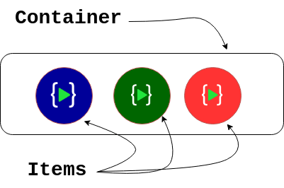
Flexbox is the one of the most efficient way to align and distribute elements in a container. In CSS every element is a box. Using CSS we can manipulate Outer box properties and Inner box properties. Flexbox is inner property of the box. It can be applied using
.box {
    display: flex;
}
when flex property is applied to a box it changes its inner property and how elements inside the box behaves.

Flexbox Properties
Flex-direction:
This property decides the direction of flex items inside the container
.container {
  flex-direction: row | row-reverse | column | column-reverse;
}
By default containers direction is set to row you can play with this codepen embed given below to understand more about flex direction.
Flex-wrap:
This is to wrap the items in a container by default it is set to no wrap.
.container {
  flex-wrap: nowrap | wrap | wrap-reverse;
}
In this codepen we have set to flex-wrap:wrap; so the elements arranged themselves to the next line automatically.
Justify-content:
This property is used to arrange items in a container
.container {
  justify-content: flex-start | flex-end | center | space-between | space-around | space-evenly | start | end | left | right ;
}
- flex-start` (default): items are packed toward the start of the flex-direction.
flex-end: items are packed toward the end of the flex-direction.start: items are packed toward the start of thewriting-modedirection.end: items are packed toward the end of thewriting-modedirection.left: items are packed toward left edge of the container, unless that doesn’t make sense with theflex-direction, then it behaves likestart.right: items are packed toward right edge of the container, unless that doesn’t make sense with theflex-direction, then it behaves likestart.center: items are centerd along the linespace-between: items are evenly distributed in the line; first item is on the start line, last item on the end linespace-around: items are evenly distributed in the line with equal space around them. Note that visually the spaces aren’t equal, since all the items have equal space on both sides. The first item will have one unit of space against the container edge, but two units of space between the next item because that next item has its own spacing that applies.space-evenly: items are distributed so that the spacing between any two items (and the space to the edges) is equal.
align-items:
This property defines how items arranged across the cross axis in the container
.container {
  align-items: stretch | flex-start | flex-end | center | baseline | first baseline | last baseline | start | end | self-start | self-end ;
}
stretch(default): stretch to fill the container (still respect min-width/max-width)flex-start/start/self-start: items are placed at the start of the cross axis. The difference between these is subtle, and is about respecting theflex-directionrules or thewriting-moderules.flex-end/end/self-end: items are placed at the end of the cross axis. The difference again is subtle and is about respectingflex-directionrules vs.writing-moderules.center: items are centered in the cross-axisbaseline: items are aligned such as their baselines align
align-content:
This is like justify-content property but this sets items in cross axis when there is extra space in cross axis
.container {
  align-content: flex-start | flex-end | center | space-between | space-around | space-evenly | stretch | start | end | baseline | first baseline | last baseline;
}
normal(default): items are packed in their default position as if no value was set.flex-start/start: items packed to the start of the container. The (more supported)flex-starthonors theflex-directionwhilestarthonors thewriting-modedirection.flex-end/end: items packed to the end of the container. The (more support)flex-endhonors theflex-directionwhile end honors thewriting-modedirection.center: items centered in the containerspace-between: items evenly distributed; the first line is at the start of the container while the last one is at the endspace-around: items evenly distributed with equal space around each linespace-evenly: items are evenly distributed with equal space around themstretch: lines stretch to take up the remaining space
Item Properties:
Order:
This is used to change the default order of HTML Content
.item {
  order: -1; /* default is 0 */
}
In this codepen red logos are ordered -1 which is lesser than default so they are pushed to start of the flexbox
flex-grow, flex-shrink, flex-basis:
This property is used to set the space occupied by the elements and negative numbers are not allowed
.item {
/* apply any one property */
  flex-grow: 1;
  flex-shrink: 1;
  flex-basis: 100px;
}
align-self :
this property allows one specific item to align itself in the container
.item {
  align-self: auto | flex-start | flex-end | center | baseline | stretch;
}
