

Media queries are a powerful tool for creating responsive web designs that adapt to different devices and screen sizes. In this article, we'll explore how media queries are being used in modern web design, highlighting some of the latest trends and best practices.
Introduction to media queries and how they work in modern web design
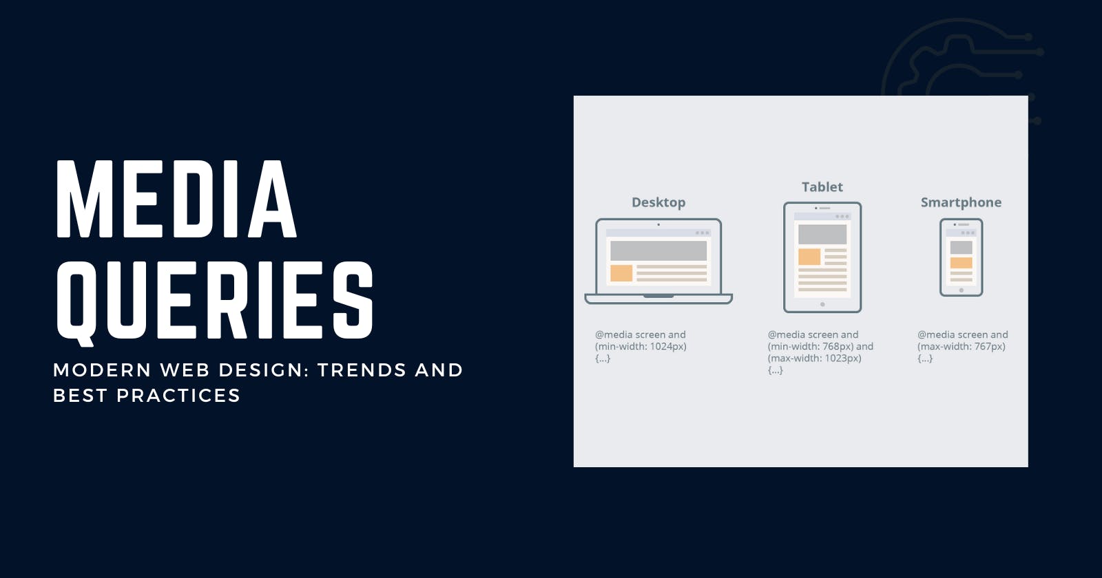
Media queries are a powerful tool for creating responsive web designs that adapt to different devices and screen sizes. They allow you to apply different styles to your website based on the characteristics of the device or viewport, such as the width, height, orientation, and resolution.
To use media queries, you need to include them in your CSS stylesheets as a separate block of code. Within this block, you can specify the media type (e.g. screen, print) and the conditions that must be met in order for the styles to be applied (e.g. min-width: 500px). For example:
@media screen and (min-width: 500px) {
  body {
    font-size: 18px;
  }
}
This media query specifies that the body font size should be 18px when the viewport is a screen with a minimum width of 500px. If the viewport does not meet these conditions, the styles within the media query will not be applied.
Media queries are a key component of modern web design because they allow you to create websites that are flexible and adaptable, providing an optimal user experience across a wide range of devices and screen sizes.
Using media queries in conjunction with other web design tools and technologies (e.g. CSS Grid, Flexbox)
Media queries can be used in conjunction with other web design tools and technologies, such as CSS Grid and Flexbox, to create responsive layouts that look great and function well on any device.
CSS Grid is a layout system that allows you to create complex, multi-dimensional layouts using rows and columns. It provides a wide range of layout options, including the ability to specify different sizes for different screen sizes and resolutions. By using media queries in conjunction with CSS Grid, you can create layouts that are optimized for different screen sizes and devices.
Flexbox is a layout system that allows you to create flexible and responsive layouts using a set of flexible containers and flexible items. It provides a range of layout options, including the ability to specify different sizes for different screen sizes and resolutions. By using media queries in conjunction with Flexbox, you can create layouts that are optimized for different screen sizes and devices.
Together, media queries and these layout systems provide a powerful toolkit for creating responsive web designs that look great and function well on any device.
Optimizing for specific devices and screen sizes with media queries
One of the key benefits of media queries is the ability to optimize a website for specific devices and screen sizes. This can be particularly useful if you want to target specific devices or platforms, such as tablets or smartphones, or if you want to optimize for different screen sizes within a particular device category.
To optimize for specific devices and screen sizes using media queries, you can use a combination of media types and media features to target specific devices or viewports.
For example, you might use the "screen" media type to target devices with screens, such as computers, tablets, and smartphones, and then use media features such as "min-width" or "max-width" to specify the range of screen sizes that the styles should be applied to.
You can also use media features such as "orientation" and "resolution" to optimize for different orientations and resolutions. For example, you might use a media query like this to apply styles to tablets in landscape orientation:
@media screen and (min-width: 768px) and (max-width: 1024px) and (orientation: landscape) {
  /* Styles go here */
}
By using media queries in this way, you can create styles that are tailored specifically to different devices and screen sizes, ensuring that your website provides an optimal user experience on any device.
Designing for different orientations and resolutions with media queries
Media queries can also be used to design for different orientations and resolutions. This is particularly useful for devices such as tablets and smartphones, which can be used in both portrait and landscape orientation and have a wide range of screen resolutions.
To design for different orientations with media queries, you can use the "orientation" media feature. For example, you might use a media query like this to apply styles to tablets in landscape orientation:
@media screen and (min-width: 768px) and (max-width: 1024px) and (orientation: landscape) {
  /* Styles go here */
}
To design for different resolutions with media queries, you can use the "resolution" media feature. For example, you might use a media query like this to apply styles to high-resolution screens:
@media screen and (resolution: 192dpi) {
  /* Styles go here */
}
By using media queries in this way, you can create styles that are tailored specifically to different orientations and resolutions, ensuring that your website looks great and functions well on any device.
Structuring media queries for maximum flexibility
Properly structuring your media queries is important for ensuring that they are flexible and maintainable. Here are a few best practices for structuring media queries for maximum flexibility:
Use mobile-first design principles: Mobile-first design means starting with the smallest screen size and working your way up, rather than the other way around. This can help you to create styles that are more flexible and adaptable, as they will be designed to work on smaller screens first and then scaled up for larger screens.
Use a clear and logical structure: Organize your media queries in a clear and logical way, grouping related styles together and separating them from unrelated styles. This will make it easier to understand and maintain your media queries over time.
Use appropriate media types and features: Choose the right media types and features for your media queries, based on the specific characteristics of the devices and viewports that you want to target. For example, use the "screen" media type to target devices with screens, and use media features such as "min-width" and "max-width" to specify the range of screen sizes that the styles should be applied to.
Use descriptive and meaningful names: Use descriptive and meaningful names for your media queries, rather than using generic names like "mobile" or "desktop." This will make it easier to understand the purpose and function of each media query.
By following these best practices, you can structure your media queries in a way that is flexible, maintainable, and easy to understand.
Testing and debugging media queries
Testing and debugging media queries is an important part of the web design process, as it helps to ensure that your media queries are working correctly and providing the desired results. Here are a few tips for testing and debugging media queries:
Use a responsive design tool: Many modern web browsers come with built-in responsive design tools that allow you to test how your website looks and functions on different devices and screen sizes. These tools can be a helpful way to test and debug your media queries, as they allow you to see how your styles are being applied in real-time.
Use a mobile device emulator: A mobile device emulator is a tool that allows you to test how your website looks and functions on different mobile devices. This can be especially useful if you are designing for specific devices or platforms, as it allows you to see exactly how your website will look on those devices.
Validate your media queries: Use a tool like the W3C CSS Validation Service to validate your media queries and ensure that they are correctly formatted. This can help to catch syntax errors and other issues that can cause your media queries to fail.
Test on real devices: While testing on emulators and responsive design tools can be helpful, it's also important to test your media queries on real devices to ensure that they are working as intended. This will allow you to catch any issues that might not be apparent when testing on emulators or in responsive design tools.
By following these tips, you can effectively test and debug your media queries, ensuring that they are working correctly and providing the desired results.
Emerging trends in media query usage (e.g. "mobile first" design, 5G, IoT)
There are a number of emerging trends in media query usage that are worth noting, including the adoption of "mobile first" design principles, the growth of 5G networks, and the rise of the Internet of Things (IoT).
Mobile first design: Mobile first design is a design approach that prioritizes the needs of mobile users over those of desktop users. It involves designing for the smallest screen size first and then scaling up for larger screens, rather than the other way around. This approach has become increasingly popular in recent years as the number of mobile users has grown, and it relies heavily on media queries to create flexible and responsive designs.
5G networks: The proliferation of 5G networks is expected to have a significant impact on media query usage, as it will enable faster download speeds and lower latency, making it possible to deliver more complex and interactive content to users. This could lead to the development of new media features and media types that allow designers to optimize their websites for 5G networks.
Internet of Things (IoT): The rise of the Internet of Things (IoT) is also expected to impact media query usage, as it will create a wide range of new devices and platforms that need to be supported by responsive designs. This could lead to the development of new media features and media types that allow designers to optimize their websites for these devices.
Overall, these emerging trends highlight the ongoing importance of media queries in modern web design, and the need for designers to stay up-to-date with the latest trends and best practices in media query usage.
In conclusion, media queries are a powerful tool for creating responsive web designs that adapt to different devices and screen sizes. By using media queries in conjunction with other web design tools and technologies, such as CSS Grid and Flexbox, designers can create visually appealing and user-friendly layouts that are optimized for different devices and screen sizes. Properly structuring media queries, testing and debugging them, and staying up-to-date with emerging trends and best practices are all key to creating effective and successful responsive designs. As the number of devices and screen sizes continues to grow, media queries will remain an essential tool for creating websites that provide an optimal user experience on any device.